A new review of a new machine with a new angle…
I didn’t click on at first but the machine is named after the great pyramid of Giza as triangles are its theme.
Inside, it’s black at the front with circular lights, and the screen mount is triangular.
Your course choices are Beauty and Edgy. Beauty will ONLY give you close up shots so if you want full-length be sure to choose Edgy.
You take your picture straight away in succession in the Lady By Tokyo way. One major surprise was that you only get to take five pictures! There was a difference in that there is one normal close up shot, then two taken on a diagonal then two full length (if you chose Edgy).
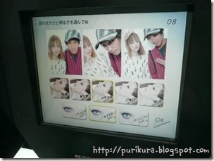
After you’ve taken your shots you get a preview where you can choose your eyes and skin settings.
Once through to the other screen the first thing you have to choose is what kind of group you are. I missed getting a clear shot of the screen but you have a choice of ‘two friends’, ‘many friends’ or ‘darling and honey’. Then you choose your situation. It had Date, Birthday and Christmas (coming soon). There was no skip, and I wasn’t on a date… and it wasn’t anyone’s birthday. But reading the Japanese ‘date’ just means ‘going out and about’ so that was the one to choose.
Then you enter your names.
The set up is a little different to other machines, the pens are on the right of the screen. You choose the style and colour separately so you can mix and match but there’s less overall options than many machines. However I think there’s plenty to choose from!
At the bottom you find the rest of the decorations. They are mostly of the modern style, sometimes it was hard to place thin lined, one-colour decorations over different colour clothes!
Names:
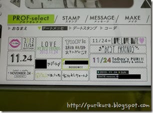
Date messages: (I assume this section is different depending on how you answer the first questions) I like how the name of the city you are in appears in the stamps! It’s where the black boxes are.
Date stamps, I like the different activity ones. It makes your purikura more of a diary.
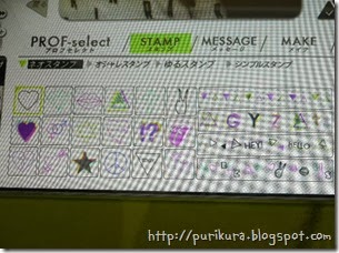
Stamps examples:
The message stamps. There was quite a lot with the name of the machine on it which is ok maybe once but I’d rather have other choices. Maybe it’s just because I was with a guy friend but I noticed that a LOT of the stamps said ‘girls’ on them so I couldn’t use them either!
Looking back I realised there’s no font for you to spell out your own words, or do initials.
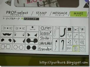
Under ‘Make’ you have some cheek decorations, lip colours and cute accessories.
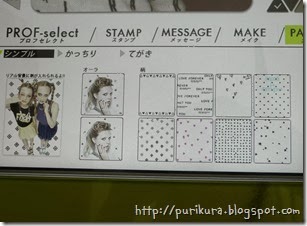
I didn’t notice at first but there’s no backgrounds to choose from in this machine. In fact they market that you can see the real floor and background as a plus. I think it’s supposed to look like studio shots. But if you want a little bit of a background you can add patterns from the ‘Patterns’ tab. You can choose an ‘aura’ or an all over pattern.
As with many machines you can make graphics for your blog too.
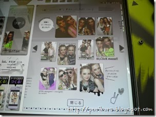
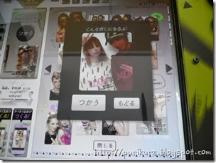
There’s a function like ‘one-touch’ you can choose from the button in between the two screens. It opens a new menu with various designs you can preview and choose if you are in a hurry!
There are a few layout options BUT it prints out in a much wider way than usual purikura…
The usual size (Girl’s Photographer on the left) fits well into a standard size purse (change purse? I don’t know what Americans call it) but the Gyza one sticks out, I carry my purikura around for a while but this one was getting bent so I had to take it out. Putting your purikura in your purse is the easiest way to keep it safe after you take it so I found this quite annoying.
Here’s our pictures:
Normal:
(That’s what happens when you let boys decorate!)
Diagonal:
Full length:
(He drew the poop too! ><)
I used a white pen to blank out the section below the text (I’m making a tip video for that soon) because it was too hard to read otherwise.
I have to say, it looks cool and modern, the lighting is really nice on it, and it prints out nicely. However, with only five shots and the odd size of the print I can’t see me choosing this one again.












Cool!! I love the modern feel to it! Wish I could try it!
ReplyDeleteYay a new review but I'm not so sure if I like the real backdrop and floor idea. If i wanted a white wall and a floor I would use my cell phone and edit stamps over it rather then a machine.
ReplyDeleteYes, I wish I could do more reviews but I've been too busy/tired for too much fun recently! I'll try more in the new year!
DeleteI can see the appeal but I'm not sure it's for me!
i took this machine a while ago with some friends. i like that the pictures looked cool and edgy, but yeah, it's missing a little something... i didn't even notice it took only 5 pictures! lol.
ReplyDeleteand did you mean a wallet, hun? :p
I had to check the five as well because I thought we'd maybe just not selected one or something!
DeleteI thought wallets were just for guys?